Pokazywanie postów oznaczonych etykietą porównanie - comparison. Pokaż wszystkie posty

wtorek, 6 sierpnia 2019

orly breathable, from dusk to dawn - bronze ambition

dziś chcę Wam pokazać ostatni już lakier orly breathable z kolekcji from dusk to dawn. tym razem jest to (moim zdaniem) najmniej wiosenno-letni kolor, jaki tylko można sobie wyobrazić, czyli miedziany metalik o nazwie bronze ambition. no dobrze, może nazwę ma lekko wakacyjną, bo nieco kojarzy się z opalenizną, ale poza tym? no nie wiem, ja naprawdę rzadko dzielę lakiery kolorystycznie według pór roku, ale ten lakier jest dla mnie raczej typowo jesiennym odcieniem. choć w zeszłym roku w standardowej kolekcji letniej orly (neon earth) też znajdował się podobny kolor (o nazwie valley of fire). zresztą na końcu będzie porównanie tych dwóch lakierów ;)
wracając jednak do miedziaka bronze ambition, to mimo wszystko muszę powiedzieć, że to bardzo fajny lakier. i jego kolor też mi się podoba, tylko po prostu moim zdaniem nie jest wiosenno-letni ;) wygodnie się maluje, kryje przy dwóch warstwach, szybko wysycha. pociągnięcia pędzelka są minimalnie widoczne, ale nie jest to typowy frost. no i lakier jest z kolekcji breathable, która odżywia nasze paznokcie, a dodatkowo nie potrzebujemy bazy ani topu, bo to taki kompleksowy produkt :)
bardzo lubię serię breathable i cieszę się, że w jej skład wchodzi coraz więcej lakierów o coraz ciekawszych i mniej oczywistych kolorach i wykończeniach :)

wszystkie lakiery orly kupicie na orlybeauty.pl


today I'd like to show you last orly polish from breathable collection called from dusk to dawn. this time it's the least spring/summer shade you could ever imagine (of course in my opinion) - copper metallic called bronze ambition. well, maybe its name reminds of holidays and tanned skin a bit, but besides that? I don't know, I really do not divide colors for seasons very often, but this polish even for me has a typical fall shade. though in last year's collection orly also had similar polish during summer (valley of fire from neon earth collection). at the end you will find comparison of these two ;)
anyway, back to bronze ambition polish, I have to tell you that this polish is really good after all. and its color is also nice and I like it, I just think it's not a spring or summer shade imo ;) it applies nicely, is fully opaque in two easy coats and dries fast. brush strokes are visible, but not very much, because it's not a typical frost polish. and it's worth to mention that this polish is from breathable series, so it nourish our nails and we don't need base or top coat, because this polish is a complex product that do everything for us :) I really like breathable series and I'm glad there are more and more new polishes in it and that the shades and finishes are not so obvious and classic :)


2 warstwy orly breathable - bronze ambition, bez topu | 2 coats of orly breathable - bronze ambition, without topcoat
i małe porównanie | and a little comparison:

niedziela, 2 grudnia 2018

orly - seize the clay (the new neutral - fall 2018 collection)

ostatnim już lakierem z jesiennej kolekcji the new neutral od orly jest czerwony róż  nazwie seize the clay. mimo, że w nazwie lakieru pojawia się glina, dla mnie jest on nieco zbyt różowy na gliniasty odcień. ale jest ładny :) jest też nieco podobny do desert rose, różu z letniej kolekcji orly (klik klik), ale jednak inny. na końcu posta znajdziecie porównanie tych dwóch lakierów.
seize the clay jest mocno napigmentowany i kryje dobrze już po jednej warstwie, jednak ja standardowo zawsze nakładam dwie, więc na zdjęciach zobaczycie dwie. schnie szybko, jak wszystkie lakiery orly, a po wyschnięciu bardzo ładnie błyszczy.

ten i inne lakiery orly możecie kupić na orlybauty.pl


last orly polish from fall collection the new neutral is red pink shade called seize the clay. despite clay in its name, this polish is much too pink for a clay for me. but it's really nice :) and it's a bit similar to desert rose - pink shade from summer orly collection (click click), but they are definitely not dupes. you will find comparison of these two shades at the end of this post.
seize the clay is really well pigmented and it's opaque even in one coat. but I always apply two coats, so you can see two on pics below. polish dries really fast (like all orly polishes) and has nice glossy finish.


orly - nail defense, 2 warstwy orly - seize the clay, bez topu
orly - nail defense, 2 coats of orly - seize the clay, without topcoat
i porównanie. poza oczywistą różnicą w kolorze (seize the clay ma w sobie więcej różu i jest ciemniejszy od desert rose), to te dwa lakiery wysychają do nieco innego wykończenia. seize the clay jest mocno błyszczący, a desert rose delikatnie satynowy.

and the comparison. besides obvious difference in color (seize the clay is much more pink and are darker than desert rose), these two polishes has slightly different finish. seize the clay dries to high glossy finish and desert rose has a bit satin finish, not so glossy

olive you kelly | fall into me | cashmere crisis | snuggle up | mauvelous | seize the clay

piątek, 13 lipca 2018

część III colour alike wiosna/lato 2018 (swatche) | part III colour alike spring/summer 2018 (swatches)

pora na ostatnią część kolekcji colour alike wiosna/lato 2018. dziś pokażę Wam najbardziej radosną - zielono-żółtą część kolekcji, czyli żółty - meadowlark, zielony - lime punch i morski - arcadia. wspominałam już o tym kilka razy, ale powiem jeszcze raz, że te lakiery, które pokażę Wam dziś, podobnie jak wszystkie inne z tej kolekcji, kryją po dwóch warstwach i szybko wysychają do ładnego połysku.

today I'll show you last and the most cheerful part of spring/summer 2018 collection from colour alike - yellow - meadowlark, green - lime punch and teal - arcadia. I've mentioned it a couple of times already, but I'll say it once again ;) these polishes, just like all others from this collection are fully opaque in two easy coats, dry fast and has a nice glossy finish.
meadowlark
to zdecydowanie najweselszy kolor tej kolekcji. nie noszę żółtych lakierów zbyt często, ale czasami się zdarza i miło jest, gdy lakier ma takie właściwości, jak ten. ... ma naprawdę zwartą, treściwą konsystencję i jest dobrze napigmentowany. a do tego nie barwi płytki. jeśli miałabym komuś polecić jakiś dobry żółty lakier, to poleciłabym właśnie ten :)

it's definitely the most cheerful color from this collection. I don't usually wear yellow nails, but I do sometimes. and it's really nice, when yellow polish has such great properties jak this one. it has good, rich consistency and it's well pigmented. and don't stain nails! if I have to recommend any yellow nail polish to someone, without any doubts, it would be this one :)
lime punch
ten kolor, to po fiolecie z poprzedniego posta (klik klik), chyba mój drugi ulubieniec z tej kolekcji. żywy, niemal limonkowy odcień to coś, co zdecydowanie do mnie przemawia. nawet brak drobinek tu nie przeszkadza, bo taki kolor po prostu broni się sam. mam wrażenie, że ton mojej skóry przy takich lakierach robi się nieco dziwny, ale kolor jest po prostu piękny. a do tego nie barwi paznokci, za co kolejny ogromny plus :)

I think this shade is my second favourite from this collection, just after blurple shade from previous post (click click). vivid, bright, almost neon shade is something that I really like. even lack of particles don't bother me here. I noticed that when I paint my nails with color like this, my skin tone seems to be a little weird, but this green color is just beautiful. and it doesn't stain nails, so it's another huge adventage of this polish :)
arcadia
mam wrażenie, że to taki wakacyjny, letni kolor. bardzo lubię morski, jednak ten jak dla mnie jest troszeczkę za blady/przybrudzony. sama nie wiem, ale to po prostu nie do końca mój odcień. nie mniej jednak bardzo pasuje do kolekcji, a i maluje się nim bardzo fajnie. no i też nie brudzi skórek, ani nie farbuje płytki.

I can't stop thinking that this is such a summer and holiday shade. I'm a big fan of teal color, but I think this one is a bit too pale or dusty for me. it perfectly fits in this collection though. and it's nice to work with, and like all other polishes from this collection - doesn't stain nails and cuticles while removing.
który z tej trójki podoba Wam się najbardziej? | which one is your favourite one this time?


wtorek, 3 lipca 2018

część II colour alike wiosna/lato 2018 (swatche) | part II colour alike spring/summer 2018 (swatches)

dziś pora na kolejną porcję lakierów z wiosenno-letniej kolekcji od colour alike. tym razem pokażę Wam trochę ciemniejsze odcienie - dwa fiolety, granat i malinową czerwień. jak już wspominałam wcześniej (m.in. w poście zbiorczym klik klik), wszystkie lakiery kryją po dwóch standardowych warstwach, szybko wysychają i mają ładny połysk, a do tego maluje się nimi bardzo wygodnie i sprawnie

today there will be another - second - part of spring/summer colour alike collection. this time I'll show you a little bit darker shades - two purples, navy blue and raspberry red. as I mentioned earlier (eg. here click click), all polishes from this collection are fully opaque in two easy coats, they dry fast, has nice glossy finish and are generally really nice to work with

sailor blue
to najciemniejszy odcień z całej kolekcji - dość ciemny, idealnie wyważony granat. porównałam go poniżej i innym granatem od colour alike i wyraźnie widać, że sailor blue jest po prostu wyważony ;) nie za bardzo w stronę zieleni, tylko tak w sam raz. ładny, ciemny odcień i co ważne, nie farbuje płytki ani skórek, co czasem zdarza się w przypadku takich kolorów.

it's the darkest shade of all spring/summer collection - it's quite dark, perfectly balanced navy blue. I compared it with another CA's navy blue and it is clear that sailor blue is just perfectly balanced shade ;) not too much into green, just on point. pretty, dark shade and - what really matters - it doesn't stain nails or cuticles, which is common in shades like this.

ultra violet
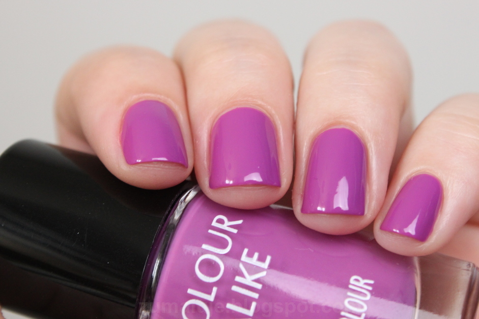
to chyba mój ulubiony kolor z całej tej kolekcji. niby zwykły krem, ale jednak żywy fiolet, mocno w stronę niebieskiego, można by nawet powiedzieć, że to blurple (a na niektórych monitorach może wyglądać jak granat). żywy, energetyczny, świetny kolor - idealny na lato (oraz na każdą inną porę roku!). jest mi tylko szkoda, że gdy używałam go do zdobienia, tak dużo ubyło go z buteleczki (ale o tym w niedalekiej przyszłości ;) ) w każdym razie jak najbardziej polecam każdej fance fioletu!

I think this is my favourite color from this collection. maybe it's a creme shade, but it's really vivid and energetic purple. it leans towards blue, well you may even say it's a blurple shade (but I'm sure it will look like navy blue on some monitors). great vivid color - perfect for summer (and for any other season as well!). I'm just a little sad that when I used it for nail art, so many polish dissapeared from the bottle (but I will tell you more about it in near future ;) ). anyway, I highly recommend it to every fan of purple shades!

spring crocus
choć na prawdę uwielbiam fiolet, wolę jednak te chłodniejsze odcienie. a ten lakier ma zdecydowanie ciepły odcień i ma w sobie dużo czerwonych tonów. bardzo dobrze to widać, gdy stoi koło kolejnego lakieru - czerwonego. jak są obok siebie, to po prostu do siebie pasują. jednak muszę przyznać, że fiolet ... na paznokciach prezentuje się wyjątkowo dobrze :) i mimo początkowej lekkiej niechęci do odcienia, bardzo dobrze czułam się z nim na paznokciach.

I'm a big fan of purples, but I prefer more cool-toned shades. and this one definitely has a warm-toned shade and a lot of red untdertones. you can see it especially when it's next to red polish from this collection, they just fit there. though I like cool-toned shades more, I have to admit that spring crocus looks really good on nails :) and I liked wearing it a lot.

cherry tomato
chyba każdy od czasu do czasu sięga po czerwony lakier. ja mam dokładnie tak samo. ten lakier, choć nazywa się cherry tomato, ma taki lekko malinowy odcień, w sensie nie jest to róż, ale zdecydowanie widać te tony. i na pewno nie jest to czerwień pomarańczowa, pomidorowa, ani krwista. po prostu jest tam nutka różu ;) choć cherry tomato nie jest jest aż tak różowy jak #526 lajkonik (również od CA). od czasu do czasu lubię takie kolory na paznokciach, a osobom, które akceptują tylko czerwień, ten lakier na pewno podpasuje :) tym bardziej, że nie przebarwia płytki, ani nie farbuje skórek przy zmywaniu.

I think everyone paint their nails red from time to time. and I have exactly the same. this polish - cherry tomato, despite its name, has visible hint of pink. well, it's definitely not an orange red, a tomato red or blood red. there is just a hint of pink ;) but comparing to other CA's polishes, it's not as pink as #526. I like wearing such shades from time to time, but this color will be reat for people who accept only red nail polish ;) and what is really important, this polish doesn't stain nails or cuticles.

który tym razem podoba Wam się najbardziej? | which one do you like the most this time?
Related Posts Plugin for WordPress, Blogger...