Pokazywanie postów oznaczonych etykietą blurple. Pokaż wszystkie posty

wtorek, 19 marca 2019

orly - nebula (deep wonder - winter 2018 collection)

po chwilowej przerwie przychodzę do Was z kolejnym lakierem z zimowej kolekcji orly deep wonder. tym razem jest to niebiesko-fioletowy glassfleck o nazwie nebula. jak już wspominałam, wiele osób określa ten lakier (podobnie jak dwa inne z tej kolekcji - lucid dream i retrograde) jako metaliczny, jednak moim zdaniem to typowy lakier glassfleckowy. w ciemnej bazie o kolorze blurple znajdziemy mnóstwo większych skrzących drobinek o nieregularnych kształtach, które jednak na paznokciach tworzą gładką taflę - nie odstają i nie haczą jak brokat. w ogóle muszę przyznać, że lakier nebula jest bardzo ciekawy i niepowtarzalny :) prawdziwy unikat i jeśli lubicie błyskotki, to warto go mieć :) a do tego super kryje już przy jednej warstwie, chociaż wiadomo, że druga zawsze pogłębi kolor i w moim przypadku da jakieś wymagiinowane poczucie "pełności" manicure'u ;)

wszystkie lakiery orly dostaniecie na orlybeauty.pl

after short break I'd like to show you next orly polish from their winter collection deep wonder. it's blue-purple (called brurple) glassfleck polish called nebula. as I mentioned before, many people say this polish (as well as two others from this collection - lucid dream and retrograde) has metallic finish, but for me it's 100% glassfeck. in dark blurple base we have loads of larger shimmering particles irregular in shape. but as in glassflecks, these particles don't behave like glitter - polish dries to smooth finish. and I have to admit nebula is a really interesting and unique polish :) if you like all that glitters, you should have it :) and it has also great qulity - it's fully opaque in even one coat, although two coats give it more depth and  - in my case - I have this feeling my manicure is complete ;)


orly - nail defense, 2 warstwy orly - nebula, bez topu
orly - nail defense, 2 coats of orly - nebula, without topcoat


wtorek, 3 lipca 2018

część II colour alike wiosna/lato 2018 (swatche) | part II colour alike spring/summer 2018 (swatches)

dziś pora na kolejną porcję lakierów z wiosenno-letniej kolekcji od colour alike. tym razem pokażę Wam trochę ciemniejsze odcienie - dwa fiolety, granat i malinową czerwień. jak już wspominałam wcześniej (m.in. w poście zbiorczym klik klik), wszystkie lakiery kryją po dwóch standardowych warstwach, szybko wysychają i mają ładny połysk, a do tego maluje się nimi bardzo wygodnie i sprawnie

today there will be another - second - part of spring/summer colour alike collection. this time I'll show you a little bit darker shades - two purples, navy blue and raspberry red. as I mentioned earlier (eg. here click click), all polishes from this collection are fully opaque in two easy coats, they dry fast, has nice glossy finish and are generally really nice to work with

sailor blue
to najciemniejszy odcień z całej kolekcji - dość ciemny, idealnie wyważony granat. porównałam go poniżej i innym granatem od colour alike i wyraźnie widać, że sailor blue jest po prostu wyważony ;) nie za bardzo w stronę zieleni, tylko tak w sam raz. ładny, ciemny odcień i co ważne, nie farbuje płytki ani skórek, co czasem zdarza się w przypadku takich kolorów.

it's the darkest shade of all spring/summer collection - it's quite dark, perfectly balanced navy blue. I compared it with another CA's navy blue and it is clear that sailor blue is just perfectly balanced shade ;) not too much into green, just on point. pretty, dark shade and - what really matters - it doesn't stain nails or cuticles, which is common in shades like this.
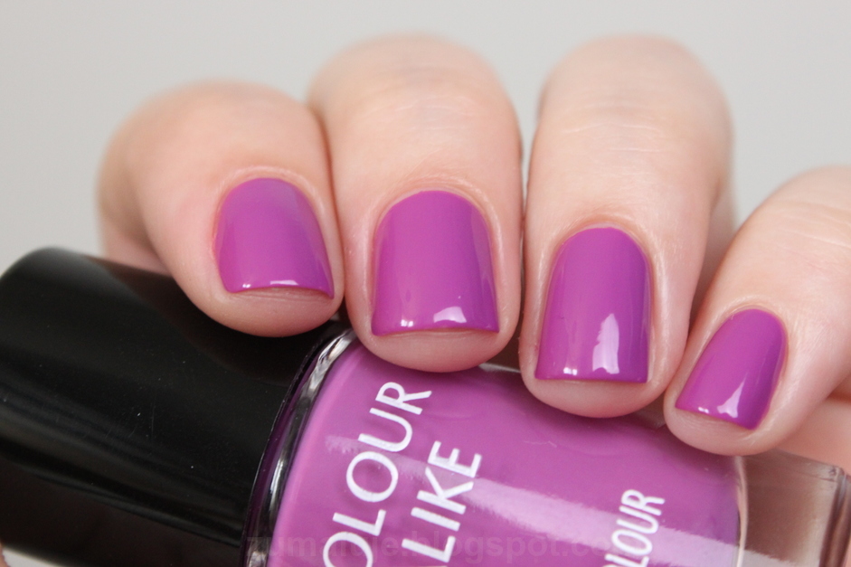
ultra violet
to chyba mój ulubiony kolor z całej tej kolekcji. niby zwykły krem, ale jednak żywy fiolet, mocno w stronę niebieskiego, można by nawet powiedzieć, że to blurple (a na niektórych monitorach może wyglądać jak granat). żywy, energetyczny, świetny kolor - idealny na lato (oraz na każdą inną porę roku!). jest mi tylko szkoda, że gdy używałam go do zdobienia, tak dużo ubyło go z buteleczki (ale o tym w niedalekiej przyszłości ;) ) w każdym razie jak najbardziej polecam każdej fance fioletu!

I think this is my favourite color from this collection. maybe it's a creme shade, but it's really vivid and energetic purple. it leans towards blue, well you may even say it's a blurple shade (but I'm sure it will look like navy blue on some monitors). great vivid color - perfect for summer (and for any other season as well!). I'm just a little sad that when I used it for nail art, so many polish dissapeared from the bottle (but I will tell you more about it in near future ;) ). anyway, I highly recommend it to every fan of purple shades!

spring crocus
choć na prawdę uwielbiam fiolet, wolę jednak te chłodniejsze odcienie. a ten lakier ma zdecydowanie ciepły odcień i ma w sobie dużo czerwonych tonów. bardzo dobrze to widać, gdy stoi koło kolejnego lakieru - czerwonego. jak są obok siebie, to po prostu do siebie pasują. jednak muszę przyznać, że fiolet ... na paznokciach prezentuje się wyjątkowo dobrze :) i mimo początkowej lekkiej niechęci do odcienia, bardzo dobrze czułam się z nim na paznokciach.

I'm a big fan of purples, but I prefer more cool-toned shades. and this one definitely has a warm-toned shade and a lot of red untdertones. you can see it especially when it's next to red polish from this collection, they just fit there. though I like cool-toned shades more, I have to admit that spring crocus looks really good on nails :) and I liked wearing it a lot.

cherry tomato
chyba każdy od czasu do czasu sięga po czerwony lakier. ja mam dokładnie tak samo. ten lakier, choć nazywa się cherry tomato, ma taki lekko malinowy odcień, w sensie nie jest to róż, ale zdecydowanie widać te tony. i na pewno nie jest to czerwień pomarańczowa, pomidorowa, ani krwista. po prostu jest tam nutka różu ;) choć cherry tomato nie jest jest aż tak różowy jak #526 lajkonik (również od CA). od czasu do czasu lubię takie kolory na paznokciach, a osobom, które akceptują tylko czerwień, ten lakier na pewno podpasuje :) tym bardziej, że nie przebarwia płytki, ani nie farbuje skórek przy zmywaniu.

I think everyone paint their nails red from time to time. and I have exactly the same. this polish - cherry tomato, despite its name, has visible hint of pink. well, it's definitely not an orange red, a tomato red or blood red. there is just a hint of pink ;) but comparing to other CA's polishes, it's not as pink as #526. I like wearing such shades from time to time, but this color will be reat for people who accept only red nail polish ;) and what is really important, this polish doesn't stain nails or cuticles.

który tym razem podoba Wam się najbardziej? | which one do you like the most this time?

piątek, 8 lipca 2016

colour alike, stars - 597 castor

ostatnio było dużo starszych swatchy i nawet kilka zdobień, to teraz pokażę Wam coś w miarę nowego. jakiś czas temu colour alike wypuściło kolekcję multichromów stars. jeden z nich - sirius pokazywałam już Wam pokazywałam (klik). dziś przyszedł czas na drugi lakier z tej serii.
castor jest najmniej multichromowy z całej trójki. niby się zmienia, ale jeśli oczekujecie kilku kolorów, które widać jednoczenie na paznokciu, to powinnyście wybrać któryś z dwóch pozostałych lakierów z tej serii (sirius albo vega). castor jest właściwie duochromem. zmienia się od granatu/blurple do fioletu. chociaż pod dużym kątem widać tam też trochę różu, a momentami i fioletowe bordo. więc niby na upartego można powiedzieć, że to multichrom, ale głównie widzimy granat i fiolet.
muszę powiedzieć, że początkowo ten lakier mnie zawiódł i to właśnie tą zmianą kolorów, której prawie nie widać. ale wiadomo, nowa kolekcja, zdjęcia promocyjne i w butelkach tęcza. malujesz, a tam tęczy ani widu ani słychu... niestety efekt na paznokciach nie jest taki jak w butelce, ale muszę przyznać, że jak trochę ponosiłam ten lakier, to się z nim polubiłam. jest delikatny, ale jednak kolor ma ciekawy :)
nakłada się dobrze, kryje idealnie przy dwóch warstwach i nie wymaga czarnej bazy, jak większość takich lakierów. schnie szybko no i pachnie jak wszystkie lakiery CA.

do kupienia na colorowo.pl

I've been showing you a lot of older swatches and even a few nail arts lately, so now it's time for something quite new. a while ago colour alike did a collection of multichromes - stars. I've shown you one of them - sirius already (click). today I'll show you another one shade from this collection.
castor is the least multichrome from all of these three polishes. it shifts, but if you expect few different colors on your nails at the same time, you should pick another shade from this bunch (sirius or vega). castor is more like duochrome, shifting from navy blue/blurple to purple. at big angle you can see a bit of pink and sometimes even cherry crimson. so you may eventually say it's a multichrome, but mostly you can see navy blue and purple on your nails.
I have to say that at first this polish disappointed me its poor color shifting, which is actually hard to notice. but you know, brand new collection, promo pics and rainbow in the bottles. you get this polish, paint your nails and there isn't any rainbow there. you have on your nails something that looks nothing like this miracle in bottle, but I have to admit that when I've been wearing this polish for a bit I liked it much more than at the beginning. it's subtle and it has interesting shade over all :)
application is easy, it's opaque in two easy coats and it doesn't need black base like most of such polishes. it dries fast and it's scented like all of CA polishes.

you can purchase it on colouralike.com


światło dzienne, sally hansen - diamond strenght, 2 warstwy colour alike - 597 castor, bez topu
daylight, sally hansen - diamond strenght, 2 coats of colour alike - 597 castor, without top coat

Related Posts Plugin for WordPress, Blogger...